To make Grid elements consisting of columns and rows are placed in the grid container. Property values are a list separated by spaces, where each value defines thewidth relative to the column. If you want the grid layout to contain 4 columns, you need to set the width of 4 columns. If all columns are the same width, you can set the width to The following example sets a grid layout with 4 columns: Example Note: if you have more than 4 grid elements in a 4-column grid, the grid layout generates a new row to place the element. Example Property values are a list separated by spaces, where each value defines theheight relative to the row: Example Note: the total width of the grid must be less than the width of the container to make Example Example Example Example Example Example Note: the total height of the grid element must be less than the height of the container to make Example Example Example Example Example Example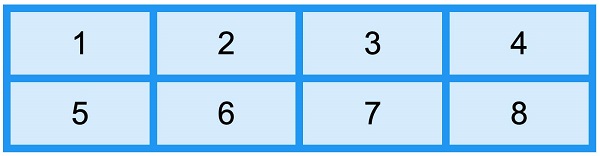
8.25.1. Grid container 
HTML
element into a grid container, you can set the
display
property is set to
grid
or
inline-grid
.
grid-template-columns
attribute 
grid-template-columns
property defines the number of columns in the gridlayout, and it can also set the width of each column.
auto
..grid-container {
display: grid;
grid-template-columns: auto auto auto auto;
}
grid-template-columns
property can also be used to specify the width of the column..grid-container {
display: grid;
grid-template-columns: 80px 200px auto 40px;
}
grid-template-rows
attribute 
grid-template-rows
property to set the height of each row..grid-container {
display: grid;
grid-template-rows: 80px 200px;
}
justify-content
attribute 
justify-content
property is used to align the grid within the container and set how to allocate space between and around elements along the principal axis (or grid row axis) of the elastic container.
justify-content
property takes effect.
justify-content
for more information, please refer to: CSS justify-content attribute.grid-container {
display: grid;
justify-content: space-evenly;
}
.grid-container {
  display: grid;
  justify-content: space-around;
}
.grid-container {
  display: grid;
  justify-content: space-between;
}
.grid-container {
  display: grid;
  justify-content: center;
}
.grid-container {
  display: grid;
  justify-content: start;
}
.grid-container {
  display: grid;
  justify-content: end;
}
align-content
attribute 
align-content
property is used to set the alignment of vertically oriented grid elements in the container.
align-content
property takes effect..grid-container {
display: grid;
height: 400px;
align-content: center;
}
.grid-container {
  display: grid;
  height: 400px;
  align-content: space-evenly;
}
.grid-container {
  display: grid;
  height: 400px;
  align-content: space-around;
}
.grid-container {
  display: grid;
  height: 400px;
  align-content: space-between;
}
.grid-container {
  display: grid;
  height: 400px;
  align-content: start;
}
.grid-container {
  display: grid;
  height: 400px;
  align-content: end;
}