A grid is a set of intersecting horizontal and vertical lines that define the columns and rows of the grid.
CSS provides a grid-based layout system with rows and columns that makes it easier for us to design web pages without using floats and positioning.
The following is a simple page layout, using a grid layout, with six columnsand three rows:
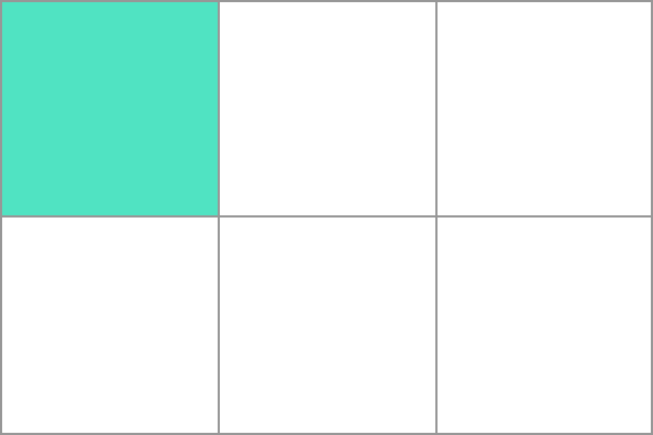
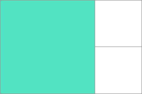
Grid layout is supported in some of the latest browser versions. 57.0 16.0 52.0 10 44 A grid layout consists of a parent element and one or more child elements. When a We passed These attributes define the orbit of the grid, which is the space between any two lines in the grid. In the following figure, you can see the track of a green box-the first row track of the grid. The second line has three white box tracks. The following example we use Example The following example we use Example Tracks can be defined in any unit of length. The grid introduces the The following example defines a mesh definition that creates three equally wide tracks that grow and contract with available space. Example A grid cell is the smallest unit in a grid element, which is conceptually similar to a cell in a table. Now looking back to our previous example, oncea grid element is defined in a parent element, its child elements will be arranged in each predefined grid cell. In the following figure, I will highlight the first grid cell. Grid elements can extend one or more cells in the direction of rows or columns and create a grid area. The shape of the grid area should be a rectangle-that is, you cannot create a mesh area similar to the “L” shape.The highlighted grid area in the following illustration extends 2 columns and 2 rows. The vertical direction of a grid element is called a Column. The horizontal direction of a grid element is called a Row. Grid spacing (Column Gap) refers to the horizontal or vertical spacing between two grid elements. You can use the following properties to resize the gap: The following examples use the Example The following examples use the Example Example Example The intersection between column and column, row and row is the grid line. For example, in the following three-column, two-row grid, there are four vertical grid lines (gray circle marks) and three horizontal grid lines (black circle marks). You can refer to these line numbers when setting grid elements. The following figure defines four vertical grid lines and four horizontal grid lines: The numbering order of the grid lines depends on the writing mode of the article. In a language written from left to right, the grid line numbered 1 is on the far left. In languages written from right to left, the grid line numbered 1 is on the far right. Next, I used In the following example, we set the gridlines of a grid element to start with the first column and end with the third column: Example In the following example, we set the gridlines of a grid element to start onthe first line and end on the third line: Example Attribute Description Column-gap Specify the gap between columns Gap Abbreviated properties of row-gap and column-gap Grid Abbreviated properties of grid-template-rows, grid-template-columns, grid-template-areas, grid-auto-rows, grid-auto-columns, and grid-auto-flow Grid-area Specify the name of the grid element, or it can be an abbreviated attribute of grid-row-start, grid-column-start, grid-row-end, and grid-column-end Grid-auto-columns Refers to the default column size Grid-auto-flow Specify how the automatic layout algorithm works, and specify exactly how the elements that are automatically laid out in the grid are arranged. Grid-auto-rows Refers to the default row size Grid-column Abbreviated properties of grid-column-start and grid-column-end Grid-column-end Specify the end position of the grid element column Grid-column-gap Specify the spacing size of the grid elements Grid-column-start Specify the start position of the grid element column Grid-gap Abbreviated properties of grid-row-gap and grid-column-gap Grid-row Abbreviated properties of grid-row-start and grid-row-end Grid-row-end Specify the end position of the grid element row Grid-row-gap Specify the row spacing of the grid element Grid-row-start Specify the start position of the grid element row Grid-template Abbreviated properties of grid-template-rows, grid-template-columns, and grid-areas Grid-template-areas Specify how rows and columns are displayed, using named grid elements Grid-template-columns Specify the size of the columns and the number of columns set in the grid layout Grid-template-rows Specify the size of the rows in the grid layout Row-gap Specify the spacing between two rows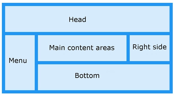
8.24.1. Browser support 
8.24.2. Grid element 
Example 
<div class="grid-container">
  <div class="grid-item">1</div>
  <div class="grid-item">2</div>
  <div class="grid-item">3</div>
  <div class="grid-item">4</div>
  <div class="grid-item">5</div>
  <div class="grid-item">6</div>
  <div class="grid-item">7</div>
  <div class="grid-item">8</div>
  <div class="grid-item">9</div>
</div>
8.24.3.
display
attribute 
HTML
element sets the
display
property is set to
grid
or
inline-grid
after that, it becomes a grid container, and all lineal child elements of this element will become grid elements.Example 
.grid-container {
  display: grid;
}
Example 
.grid-container {
  display: inline-grid;
}
8.24.4. Grid orbit 
grid-template-columns
and
grid-template-rows
property todefine rows and columns in the grid.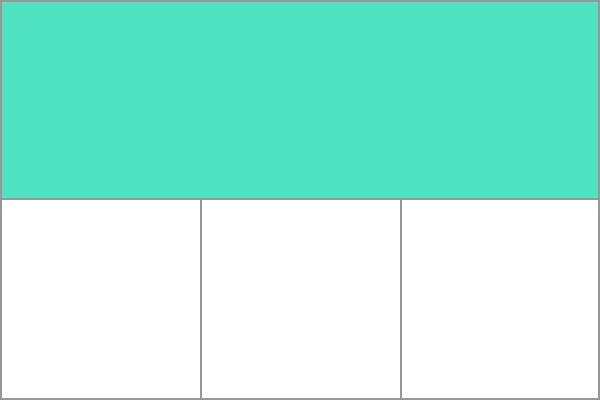
grid-template-columns
property to create four columns in the grid container.grid-container {
display: grid;
grid-template-columns: auto auto auto auto;
}
grid-template-rows
property to set the height of the row in the grid container.grid-container {
display: grid;
grid-template-rows: 100px 300px;
}
fr
Unit 
fr
units to help us create flexible mesh tracks. One the
fr
unit represents an equal portion of the available space in the grid container..grid-container {
display: grid;
grid-template-columns: 1fr 1fr 1fr;
}
Grid element 
Grid region 
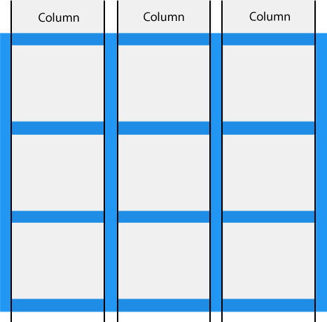
8.24.5. Grid column 
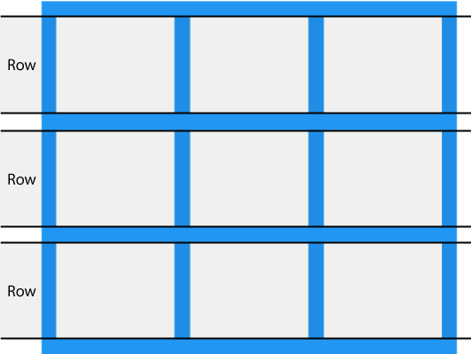
8.24.6. Grid row 
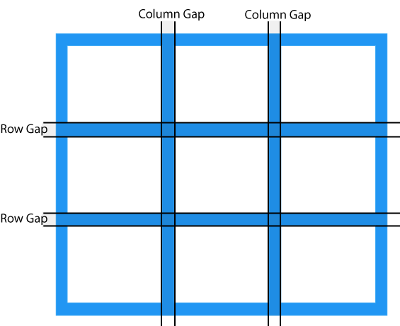
8.24.7. Grid spacing 
grid-column-gap
grid-row-gap
grid-gap
grid-column-gap
property to set the gridspacing between columns.grid-container {
display: grid;
grid-column-gap: 50px;
}
grid-row-gap
property to set the grid spacing between rows.grid-container {
display: grid;
grid-row-gap: 50px;
}
grid-gap
The property is
grid-row-gap
and
      the
      grid-column-gap
, The abbreviation of the property:.grid-container {
display: grid;
grid-gap: 50px 100px;
}
grid-gap
property to set row and column spacing at the same time.grid-container {
display: grid;
grid-gap: 50px;
}
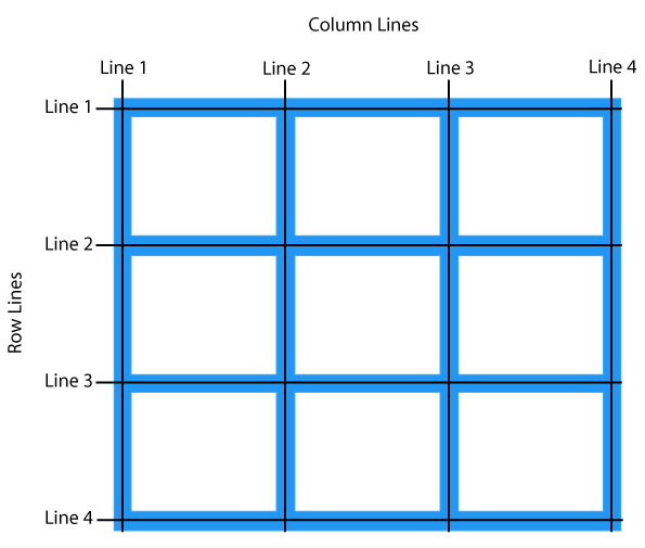
8.24.8. Grid line 
Grid
will create numbered gridlines for us to locate each grid element.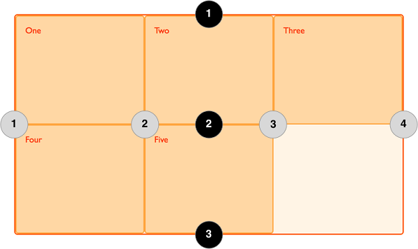
grid-column-start
,
grid-column-end
,
grid-row-start
and use the
grid-row-end
attribute to demonstrate how to use grid lines..item1 {
grid-column-start: 1;
grid-column-end: 3;
}
.item1 {
  grid-row-start: 1;
  grid-row-end: 3;
}
8.24.9. CSS Grid Properties 