We can install Bootstrap5 in two ways:
Use Bootstrap5 CDN.
From the official website getbootstrap.com download Bootstrap 5.
Libraries on Staticfile CDN are recommended in China: Bootstrap5 CDN Note: Bootstrap5 CDN In addition, you can use the following CDN services: Domestic recommended use: https://www.staticfile.org/ Internationally recommended: https://cdnjs.com/ You can download the Bootstrap5 repository from the official website https://getbootstrap.com/ . Note: in addition, you can also install it through the package management tools npm, yarn, gem, composer, etc. Bootstrap requires the use of the HTML5 file type, so you need to add a HTML5 doctype declaration. HTML5 doctype declares in the document header and sets the corresponding encoding: To make the website developed by Bootstrap friendly to mobile devices and ensure proper rendering and touchscreen scaling, you need to add a viewport meta tag to the head of the web page, as shown below: Bootstrap 5 requires a container element to wrap the content of the site. We can use the following two container classes: Bootstrap5 The following example shows a container that occupies all viewports (viewport). Bootstrap5 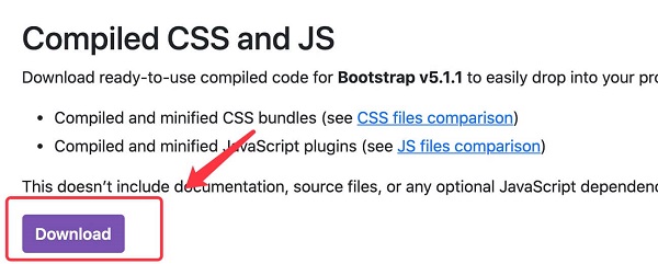
7.2.1. Bootstrap 5 CDN 
<!-- New Bootstrap 5 Core CSS Files -->
<link rel="stylesheet" href="https://cdn.staticfile.org/twitter-bootstrap/5.1.1/css/bootstrap.min.css">

<!--  popper.min.js used for pop ups, prompts, and drop-down menus -->
<script src="https://cdn.staticfile.org/popper.js/2.9.3/umd/popper.min.js"></script>

<!-- The latest Bootstrap 5 core JavaScript file -->
<script src="https://cdn.staticfile.org/twitter-bootstrap/5.1.1/js/bootstrap.min.js"></script>
popper.min.js
used to set pop-up windows, prompts, and drop-down menus.
bootstrap.bundle.js
(uncompressed version) or
bootstrap.bundle.min.js
(compressed version) contains bundled plug-ins such as
popper.min.js
and other dependent scripts, so we can also use the following code directly:<!-- New Bootstrap 5 Core CSS Files -->
<link rel="stylesheet" href="https://cdn.staticfile.org/twitter-bootstrap/5.1.1/css/bootstrap.min.css">
<!-- The latest Bootstrap 5 core JavaScript file -->
<script src="https://cdn.staticfile.org/twitter-bootstrap/5.1.1/js/bootstrap.bundle.min.js"></script>
7.2.2. Download Bootstrap 5 
npm install bootstrap
yarn add bootstrap
gem install bootstrap -v 5.1.1
composer require twbs/bootstrap:5.1.1
Create the first Bootstrap 5 page 
7.2.3. 1.Add HTML5 doctype 
<!DOCTYPE html>
<html>
  <head>
    <meta charset="utf-8">
  </head>
</html>
7.2.4. Mobile device priority 
<meta name="viewport" content="width=device-width, initial-scale=1">
width=device-width
Indicates that the width is the width of the device screen.
initial-scale=1
Represents the initial scale.Container class 
.container
class is used for containers that are fixed in width and support a responsive layout.
.container-fluid
class is used for containers that are 100% wide and occupy all viewports (viewport).
Two Bootstrap 5 pages 
.container
example<div class="container">
<h1>My first Bootstrap page</h1>
<p>These are some texts.</p>
</div>
.container-fluid
example<div class="container-fluid">
<h1>My first Bootstrap page</h1>
<p>Used. container fluid, 100% width, occupying all viewport containers.</p>
</div>