Bootstrap provides a responsive, mobile device-first streaming grid system that automatically divides into up to 12 columns as the screen or viewport (viewport) size increases.
We can also define the number of columns according to our own needs:
Bootstrap 5’s grid system is responsive, and the columns are automatically rearranged according to the screen size.
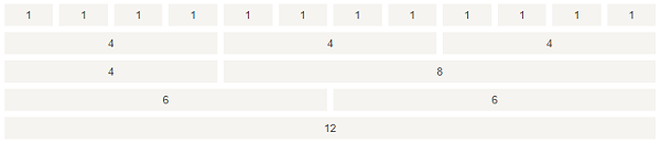
Make sure that the sum of the columns in each row is equal to or less than 12. Bootstrap 5 grid systems have the following six classes: Bootstrap5 grid system rules: Each row of the grid needs to be set up Use rows to create horizontal column groups. The content needs to be placed in a column, and only the column can be a direct child of the row. Predefined classes such as The column fills the gap between the contents of the created column. This gap is through Grid columns are created by spanning 12 specified columns. For example, to set up three equal columns, you need to use three Bootstrap 5 and Bootstrap 4 use flexbox (elastic boxes) instead of floats. One of the advantages of Flexbox is that grid columns with no specified width are automatically set to equal width and equal height columns. If you want to know more about Flexbox, you can read our CSS Flexbox tutorial. The following table summarizes how Bootstrap grid systems work on different devices: Ultra-small device < 576px Flat panel ≥ 576px Desktop display ≥ 768px Large desktop display ≥ 992px Extra large desktop display ≥ 1200px Oversized desktop display ≥ 1400px Maximum width of container None (auto) 540px 720px 960px 1140px 1320px Class prefix Number of columns and 12 Gap width 1.5rem (.75rem on each side of a column) Can be nested Yes Column sort Yes We combine the above classes to create a more flexible page layout. Tip: each class is scaled up, so if you want to set sm and md to have the same width, you just need to specify sm. The following code is the basic structure of the Bootstrap 5 grid: The first example: create a line The second example: not in every Next we can look at examples. The following example demonstrates how to create responsive columns of equalwidth on a flat panel and a larger screen. On a mobile device, where the screen width is less than 576px, the four columns will be stacked up and down: The following example demonstrates the creation of responsive columns of unequal width on a flat panel and a larger screen. On a mobile device, that is, when the screen width is less than 576px, the two columns are stacked up and down: If you set the width of only one column, the other columns will automatically divide the remaining widths. The following example will have acolumn width of 25%, 50%, 25%: Example The following example demonstrates that the width of the two columns each accounts for 50% on the display of the desktop device. On the tablet end, the width of the left column is 25%, and the width of the right column is 75%. It will be displayed on a stack on small devices such as mobile phones. Example The width ratios of the following examples for flat panels, desktops, large desktop monitors and super-large desktop monitors are 25%, 75%, 50%, 50%, 33.33%, 66.67% and 16.67%, respectively, and will be stacked on small devices such as mobile phones. Example The following example creates a two-column layout, one of which is nested within the other two columns: Example Display effect: Offset column passes through To use offset on a large screen monitor, use the For example: Example 7.4.1. Grid class 
.col
-for all devices.
.col-sm
-flat panel-screen width is equal to or greater than 576px.
.col-md
-desktop display-the screen width is equal to or greater than 768px.
.col-lg
-large desktop monitor-screen width is equal to or greater than 992px.
.col-xl
-extra large desktop monitor-screen width is equal to or greater than 1200px.
.col-xxl
-oversized desktop display-screen width is equal to or greater than 1400px.Grid system rules 
.container
(fixed width) or
.container-fluid
(full screen width) class, so that you can automatically set some outer and inner margins.
.row
and
.col-sm-4
can be used to quickly make grid layout.
.rows
the negative margin on the class sets the offset of the first row and the last column.
.col-sm-4
to set up.
.col-
.col-sm-
.col-md-
.col-lg-
.col-xl-
.col-xxl-
7.4.2. The basic structure of Bootstrap 5 grid 
Basic structure of Bootstrap5 grid 
<!-- First example: Controlling the width of columns and how to display them on different devices -->
<div class="row">
  <div class="col-*-*"></div>
</div>
<div class="row">
  <div class="col-*-*"></div>
  <div class="col-*-*"></div>
  <div class="col-*-*"></div>
</div>

<!-- Second example: Or let Bootstrap automatically handle the layout -->
<div class="row">
  <div class="col"></div>
  <div class="col"></div>
  <div class="col"></div>
</div>
       <div
       class="row">
). Then, add the required columns (
.col-*-\*
class). The first asterisk ( ) device that represents the response: sm, md, lg or xl, Second asterisk ( Represents a number, and the numbers on the same line add up to 12.
col
let bootstrap process the layout automatically, with each column in the same row equal in width: two “col”,each 50% wide. Three “col” each are 33.33% wide, four “col” each are 25% wide, and so on. Similarly, you can use the
.col-sm|md|lg|xl
to set the response rules for the column.Create columns of equal width, Bootstrap automatic layout 
Example 
<div class="row">
  <div class="col">.col</div>
  <div class="col">.col</div>
  <div class="col">.col</div>
</div>
Equal width response column 
Example 
<div class="col-sm-3">.col-sm-3</div>
<div class="col-sm-3">.col-sm-3</div>
<div class="col-sm-3">.col-sm-3</div>
<div class="col-sm-3">.col-sm-3</div>
Unequal width response column 
Example 
<div class="row">
  <div class="col-sm-4">.col-sm-4</div>
  <div class="col-sm-8">.col-sm-8</div>
</div>
Set the width of a column 
<div class="row">
  <div class="col">col</div>
  <div class="col-6">col-6</div>
  <div class="col">col</div>
</div>
7.4.3. Tablet and desktop side 
<div class="row">
    <div class="col-sm-3 col-md-6 col-lg-4 col-xl-2 p-3 bg-primary text-white">.col</div>
    <div class="col-sm-9 col-md-6 col-lg-8 col-xl-10 p-3 bg-dark text-white">.col</div>
</div>
7.4.4. Flat panel, desktop, large desktop display, oversized desktop display 
<div class="row">
    <div class="col-sm-3 col-md-6 col-lg-4 col-xl-2 p-3 bg-primary text-white">.col</div>
    <div class="col-sm-9 col-md-6 col-lg-8 col-xl-10 p-3 bg-dark text-white">.col</div>
</div>
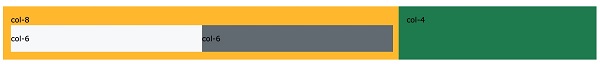
7.4.5. Nested column 
<div class="row">
  <div class="col-8">
    .col-8
    <div class="row">
      <div class="col-6">.col-6</div>
      <div class="col-6">.col-6</div>
    </div>
  </div>
  <div class="col-4">.col-4</div>
</div>
7.4.6. Offset column 
offset-*-\*
Class to set the. First asterisk (* )is sm、md、lg、xl ,Indicates the type of screen device, second asterisk( * ) can be a number from 1 to 11.
.offset-md-\*
class. These classes increase the left outer margin (margin) of a column
\*
column, where
\*
the range is from 1 to 11.
      .offset-md-
      4
is to set
.col-md-4
moved four columns to the right.<div class="row">
<div class="col-md-4">.col-md-4</div>
<div class="col-md-4 offset-md-4">.col-md-4 .offset-md-4</div>
</div>
<div class="row">
<div class="col-md-3 offset-md-3">.col-md-3 .offset-md-3</div>
<div class="col-md-3 offset-md-3">.col-md-3 .offset-md-3</div>
</div>
<div class="row">
<div class="col-md-6 offset-md-3">.col-md-6 .offset-md-3</div>
</div>