Thematic information representation
In most geographic information systems, the managed spatial data are objects in vector format, these objects not only have spatial location characteristics, but also have non-spatial attribute data. In the representation of these objects, besides displaying spatial location, which can also display one or more related attributes in a specific way to generate thematic maps.
In addition to some representation methods of general maps and their further development, thematic maps themselves need special representation methods to reflect the nature, quantity, spatial distribution and time changes of various elements, so as to enable readers to make a clear scientific analysis of thematic content elements.
In thematic maps, the basic shapes of various mapping objects are composed of points, lines, planes and their transitional forms, which reflect the distribution characteristics of phenomena, the changing time of phenomena, the quality and quantity characteristics and comprehensive characteristics. Therefore, when choosing the representation method, we can choose not only according to the distribution of thematic mapping objects (Table 11-1), but also according to their distribution characteristics (Table 11-2).
Table 11-1: Selection of symbols according to the distribution of thematic mapping objects
Distribution mode |
Represents the range of distribution |
Presentation category |
Denotes quantity |
Presentation dynamics |
|---|---|---|---|---|
Spot |
Location symbol |
Symbolic form: Geometric symbol Text symbol Pictographic symbol Symbol color |
Symbol size (primary and secondary in different shades of color) Digital annotation |
Fixed Point Extension Method Location Chart Method |
Line |
Linear symbol |
Line form Line color |
Line thickness, length, with different number of short lines |
Moving line method |
Noodles |
Face symbol (Scope method) |
Mass base method |
Point-line method, hierarchical statistical graph method, graphic statistical graph method, isoline method and layered coloring method |
Representing the extended range method, the graphical graph method of the extended graph |
Table 11-2: Selection of symbols according to the distribution characteristics of thematic cartographic objects
Distribution characteristics |
Status |
Representation method |
|---|---|---|
Fix it a little |
Movements of state in a given instant Spatial variation |
Symbol method, motion line method Symbol method and location chart method |
Fixed line |
Movements of state in a given instant Spatial variation |
Combination of linear symbol method, linear symbol and motion symbol Linear symbol overlapping |
Fixed area |
Movements of state in a given instant Spatial variation |
Substrate method, isoline method, location chart summation, range method, zoning method combined with isoline method, motion symbols Contour method, location chart and symbol sum |
Spread |
Movements of state in a given instant Spatial variation |
Point method, quality method, zoning method, chart statistics method and color statistics method, zoning and matching motion symbols Combination of point method and zoning method, chart statistics method and color statistics method |
Continuous distribution |
Movements of state in a given instant Spatial variation |
Substrate method, isoline method, location chart summation, topographic modeling to represent motion symbols Contour method, location chart summation |
Classification and content of thematic maps
The meaning of thematic map
A thematic map is a map that highlights one or several natural phenomena and socio-economic phenomena. According to the content, it can be divided into three categories: natural maps, socio-economic maps and other thematic maps.
Natural maps represent the characteristics, geographical distribution and their interrelations of various phenomena in nature, such as geological maps and hydrographic maps; socio-economic maps represent the characteristics, geographical distribution and interrelations of various social and economic phenomena, such as population maps and administrative divisions maps; and other thematic maps refer to thematic maps that do not belong to the above two categories, such as nautical maps and aerial maps.
Contents of thematic maps
There are many types of thematic maps, but most of them are composed of geographical basis and thematic content. The geographic basis is a part of the content elements on the ordinary map, such as the latitude and longitude network, water system, residential areas, traffic lines, terrain, etc. The geographic basis serves as a skeleton for the compilation of thematic content, and indicates the geographical location of the thematic content and the relationship between the thematic content and the geographical environment. The geographic map elements and level of detail on the thematic map vary according to the content of the topic.
From the point of view of materials, the thematic content includes one or more elements in the content of general map, which are displayed in a more complete and detailed way, while other elements are put in a secondary position or omitted, such as traffic maps, etc. The other is thematic elements which are not found on general map and invisible or can not be measured directly on the ground, such as population density maps.
Representation of planar topic content
There are very few real points on the ground, and they usually occupy a certain area, but the size is different. Point-like distribution elements are those that occupy a small area that cannot be expressed on a scale and are positioned. For the quality and quantity characteristics of the point distribution elements, they can be represented by dot symbols.
There are many things distributed in line or band on the ground, such as traffic lines, rivers and boundary lines, the distribution quality and quantity characteristics of these things can be represented by linear symbols.
The most commonly used methods for expressing the content of a planar topic are the isoline method, the sediment bottom method, the range method, the point value method, the symbol method, the moving line method, the statistical graph method, etc.
Isoline method
Contours refer to curves, such as contours and isotherms, on a map that represent some of the equivalent points of a phenomenon’s quantitative indicators. The isoline method should be used to represent the phenomenon of continuous distribution and gradual change on the ground, and to explain the value or intensity of this phenomenon at any point on the map. In principle, the numerical interval of contours is best a constant in order to judge whether the phenomena change sharply or gently, but there are exceptions. The size of the isoline interval depends first on the numerical range of the phenomena, and the larger the range of variation (for example, the greater the change of geomorphological elevation), the larger the interval, and vice versa. If the color is graded according to the contour line, the color should gradually deepen from light color to warm color, or gradually transit from cold color to warm color, which can improve the expressive power of the map (Fig. 11-6).
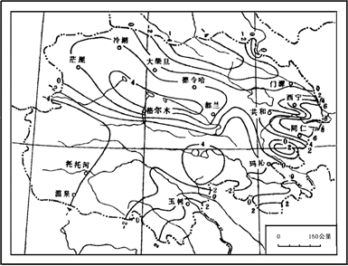
Figure 11-6: Contours
Mass base method
Substrate method, also known as background method, is used to divide the area into areas of the same quality. See Figures 11-7.
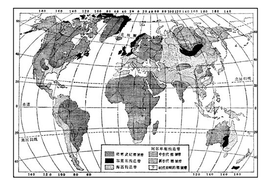
Figure 11-7: An example of the bottom method
Because the substrate method is widely used in various colors, it is sometimes called the background method. Firstly, classify or divide the phenomena according to their nature, make legends, draw the classification boundaries on the map, and then draw the same color or halo of the same phenomena or phenomena belonging to the same division. This method can be used to represent continuous surface phenomena (such as meteorological phenomena), large-area distribution phenomena (such as soil cover) or large-scale distribution phenomena (such as population). The advantage of the quality-based method is clear and beautiful, but the disadvantage is that it is not easy to express the gradual transition of various phenomena. Moreover, when there are many classifications, legends are more complex, so it is necessary to read legends in detail before reading them. Note that the two color systems of the base should not overlap each other, but the base color can overlap with halo lines. In addition, the substrate method is easy to be used in combination with other representations.
Scope method
Scope method, also known as region method, is used to express the distribution of a phenomenon in a certain range. Scope method can be divided into precise range method (see Figure 11-8-1) and general range method (see Figure 11-8-2). The former has clear boundaries and can be used to color or fill in halo lines or text notes within the boundaries. The latter can use dashed lines or dotted lines to represent contour boundaries, or not to draw contour boundaries, and only use words or single symbols to represent the general range of phenomena distribution.
Different methods can be used to represent the range of a region on a map: using solid or dashed lines of a certain figure to represent the range of the region; using different colors to unify the region; drawing different halo lines in different regions; uniformly allocating halo symbols in the region, sometimes without drawing boundary lines; annotating or using filling symbols in the region.
The difference between the scope method and the base method lies in that the phenomena presented are not all over the whole mapping area, and there is not necessarily an accurate boundary between the scope method and the base method.
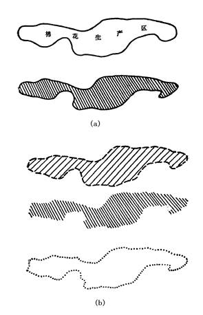
Figure 11-8: (a) exact range method, (b) rough range method
Point value method
Point-value method is used to represent the distribution and quantity of phenomena with small points on a graph, it is suitable for representing the phenomena of uneven distribution. From the density of the points on the graph, we can see the degree of concentration or dispersion of the image. In the densest place, the point can be close to but not overlapping, in the most sparse place, it can also be expressed a little; in other places, it shows the density of the point proportionally. (Figures 11-9)
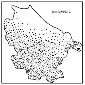
Figure 11-9: An example of point-value method
Point-value method is the further development of base method and range method. Substrate method and range method can only reflect the distribution and quality characteristics of phenomena, while point value method can show the distribution and quantity characteristics of phenomena. There are two methods of point value method: one is uniform distribution method, i.e. uniform distribution of points in a certain division unit; the other is location distribution method, i.e. distribution of points according to the actual location of the phenomenon.
The advantage of merit method is simple and clear, if the points with different colors and shapes are used properly, they can not only represent the quantitative characteristics of phenomena, but also the quality characteristics and development of phenomena.
Symbolic method
Symbolic method is to use symbols of different shapes, sizes and colors to represent the distribution of phenomena, their quantitative and qualitative characteristics. Usually, the size of symbols is used to represent the difference in quantity, and the shape and color are used to represent the difference in quality, while the symbols are drawn at the position where the phenomena are located. Symbolic method can be divided into individual symbolic method and linear symbolic method.
1) Individual symbol method
It is a special method in map notation, which is used to indicate the position of some features that are not according to the scale of the map or the area occupied by the map symbol itself, and is usually used to indicate the phenomenon of positioning by point. Individual symbols can be divided into geometric symbols, literal symbols and hieroglyphic symbols according to their shapes. Geometric symbols are the most widely used symbols in maps because they cannot accurately represent the differences in location and number. Geometric symbols have a simple set of graphics, which is easy to draw, can accurately indicate the location of objects, and is easy to compare the size. Text symbols are represented by the first two letters of the phenomenal name. The application of text symbols is limited, because the use of letters makes the map difficult to read, can not indicate the exact location of objects, can not be compared according to the size of symbols; hieroglyphic symbols are similar to the graphics of the objects represented, and can be further divided into symbolic symbols and entity symbols. The shape of the former is somewhat related to the objects represented, while the latter uses solid graphics to represent the corresponding distribution of things.
2) Linear symbol method
Linear symbols can be used not only to represent geometric concepts such as watershed, boundary lines determined on the ground (such as national boundaries), but also to represent linear distribution of objects that can not express their widths according to map scale, such as rivers and roads. Sometimes, linear symbols can be used to emphasize the main directions of the objects represented by the area on the map, such as ridge lines, mountain strike lines, etc. (Figures 11-10)
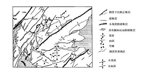
Figure 11-10: An example of linear symbolic method (geological tectonic line)
Moving line method
The moving line method usually uses arrow symbols to express the movement route and direction of phenomena, such as population migration route, ocean current and freight route. The direction of the arrow and the upper part of the arrow body should be the same, and the two wings of the arrow should be symmetrical. The thickness or width of an arrow represents the velocity intensity of the ocean current or the quantity of cargo transported; the length of an arrow represents the direction of the wind and the stability of the ocean current; the connecting arrow represents the route of motion, and the moving line method represents the movement of a surface object.
Statistical graph method
Statistical mapping method is generally expressed in the form of land use graphics according to the statistical data of each divisional unit or typical location in the mapping area. It can be divided into three types: graphic statistical map method, hierarchical statistical map method and positioning statistical map method.
1) Graphic statistical graph method
Graphic statistical map method is based on the statistical data of each divisional unit to make graphs or charts, which are drawn within the divisional unit on the map. The difference between this method and symbolic method is that it reflects a phenomenon of zoning scope rather than a phenomenon of point. Graphic statistical maps are suitable for representing absolute quantitative indicators.
More in the map mapping: linear statistical graphs - column and strip, etc., the length is proportional to the value compared; area statistics graphs - squares, circles, etc., whose area is proportional to the value being compared; stereoscopic statistics—cubes, spheres, etc., whose volume is proportional to the value being compared (Figure 11-11).
2) Hierarchical statistical mapping
Hierarchical statistical mapping represents the average density of a mapping phenomenon within a certain area unit. The hierarchical statistical map method is based on the statistical data of each divisional unit, according to the density, intensity or level of development of the phenomenon, and then according to the level, fills in different shades of color or different density halo lines on the map according to the divisional level, in order to show the differences among divisional units. Grading can be made by equal difference, equal ratio, gradual increase or arbitrary. Graded statistical graphs are suitable for representing relative quantitative indicators. The advantage of this method is that it is easy to draw and read.
3) Statistical mapping of position
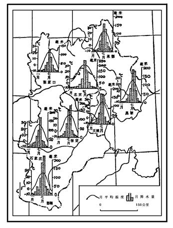
Statistical mapping of position is to map the corresponding locations on the map in the form of graphs and charts to show the changes of some phenomena in the place. Commonly used charts are bar charts, curve charts, rose charts and so on.
DEM notation
Digital elevation is a set of elevation measurement data about the layout of surface position, which is mainly applied to the topographic analysis of a region. The previous methods can only reflect the horizontal distribution characteristics of phenomena, but can not do anything about the vertical distribution characteristics. Digital elevation representation is widely used in engineering, planning and military fields.
1) Shaded Relief Map and its overlay with thematic map
In order to increase the visual effects of high and negative fluctuations in hilly and mountainous areas, cartographers have successfully applied a “shadow stereo method”, that is, the geomorphic shading method. Drawings drawn with this technique look very moving, but at a high cost, the quality and precision of the shading method largely depends on the subjective awareness and skill of the cartographer.
Once the digital topographic map is put into production and applied, the landscape shading can be realized automatically and accurately. The principle of automatic shading is based on the consideration of what the ground looks like in people’s eyes, what kind of material is used to make it, and what direction is the direction of the light source. If the grayscale and continuous tone techniques are used to represent the degree of shading in the graphics output, the results obtained look very similar to the aerial film. In fact, the geomorphic shading map automatically generated from the elevation matrix has many differences from the aerial film. Mainly manifested in:
Firstly, halo maps do not include any information of ground coverage, but only digital display of ground fluctuations.
Secondly, the light source is generally determined to be 45 degrees northwest direction, and the shadows of aerial photographs mainly change with the solar altitude angle.
Thirdly, halo maps are usually processed smoothly and comprehensively, so there is no abundant topographic details on aerial photographs.
The calculation of automatic relief halo map is very simple, first, slope and aspect are calculated based on DEM data. Then the gradient data are compared with the direction of light source, light tone gray value is obtained from the slope facing light source, and dark tone gray value is obtained from the opposite direction, the middle gray value is obtained between the two. The gray value is further determined according to the gradient.
The main research of halo map calculation is focused on the quantitative description of slope reflectance, since the formula of calculating slope reflectance is complex, the slope and slope direction are converted into reflectance, which is usually solved by establishing a lookup table to make the calculation and processing more effective (Fig. 11-12).
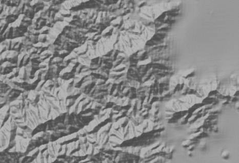
Figure 11-12: Geomorphic halo graphic representation
Halo map itself can describe the three-dimensional state of the surface, and its application in quantitative topographic analysis is expanding. If other thematic information is combined with halo map superposition, the use value of the map will be greatly improved. For example, the overlay of transport route planning map and halo map greatly enhances the intuition, which can not be achieved by traditional methods.
2) 3D surface
Many GIS software provides the ability to generate 3D projections using DEM data, usually 3D perspectives come in two forms, a smooth 3D surface and a Fishnet Diagram (Figure 11-13, Figure 11-14), other information can also be superimposed on the 3D surface map, most typically a remote sensing image of the same area or a shading map generated by the DEM to enhance its “stereoscopic”. To generate a 3D perspective, you need to set parameters such as viewpoint position and angle of view, therefore, you can create different 3D perspectives by setting different parameters and compose animations to achieve the effect of “virtual flight”.
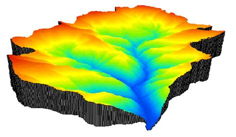
Figure 11-13: Three-dimensional perspective of a surface
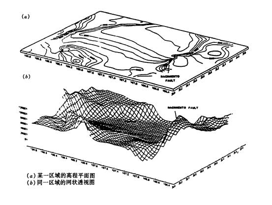
Figure 11-14: Mesh three-dimensional perspective
In the process of generating three-dimensional surface and relief halo map with grid DEM, it is worth noting that if the resolution is high, the amount of data is large and the calculation speed is reduced; if the resolution is too low, the calculation results will become rough, at this time, surface function fitting between grid points can be considered, but because the surface function is continuous, the results appear “untrue”, a better solution is to use fractal interpolation, which can generate more detailed and natural terrain.
Expressive means of thematic map content
There are many ways to express thematic maps, which need to be realized by certain means. Choosing reasonable expression method and expression means is the guarantee to improve the expressive ability of scientific content, existing means of expression can be summarized into three categories: color, lines and notes.
Color
Objects in the world have two basic characteristics: shape and color. Color is usually divided into two categories: one is black and white and various grays, called non-color; the other is color, including colors other than black, white and gray.
Color can not only make up for the defects of monochrome images, enrich the content of the frame, improve the use value of the thematic map, but also reflect the natural appearance of the drawing object, expand the appeal of the map content, and enhance the clarity and legibility of the map content. Figure 11-15 shows the RGB color cubes, with the red, green and blue primary colors set at the three corners of the color cube. The angle below the cube, the intensity of the three primary colors is 0, the color is black; the diagonal across the cube is the intensity axis, ranging from the starting point black (R, G, B) = (0, 0, 0) to white (R, G , B) = (100, 100, 100), where intensity is expressed as a percentage; the color of any point in the cube can be described by the values on the three axes of red, green, and blue (R, G, B); for example, (50, 50, 50) is dark gray, (0, 0, 100) is pure blue and so on. Red, green, and blue are called additive colors, because new colors can be obtained by adding them to black. Similarly, the subtractive primary colors can also be represented in colored cubes, which are cyan, magenta, and yellow (C, M, Y) distributed over the remaining three corners. Cyan is synthesized from blue and green, magenta is synthesized from blue and red, yellow is synthesized from green and red, and dyes and printing inks are reduced by three primary colors, and other colors are produced by subtracting their complementary colors from white. Thus, when the image is displayed, the color is measured by R, G, and B, and when printing and drawing, it is measured by C, M, and Y.
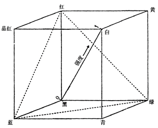
Figure 11-15: RGB color cube
In practical printing and publishing applications, because it is difficult to synthesize real black with cyan, magenta and yellow, color measurement of C, M, Y and K (black) is generally used, in addition to RGB and CMYK color metric spaces, there are other color representations:
HLS color expression, HLS refers to Hue, Brightness and Saturation, which can better reflect people’s perception of color.Although the RGB color space constitutes a cube, it is not linear, that is, the closeness of the two colors cannot be simply measured by the Euclidean distance. The HLS chromaticity space solves the problem better, the color tone reflects people’s classification of colors, such as “pure red”, “magenta”, “pink” and so on; brightness indicates the degree of color “black”, white brightness is highest, black is lowest; saturation reflects the purity of the color, if one color is blended into gray, the saturation is reduced, for example, pink saturation is lower than pure red.
CIE color system, CIE (Commission International de I’Eclairage) color system is an international universal color standard. It provides a consistent color definition method, but it is too complicated to master.
Munsell color system, which is a widely used system for color design, which uses hue, color value (Value is equivalent to brightness), and chromaticity (Chroma, equivalent to saturation) to describe color, and use a proportional value to reflect human perception.
Various color metrics are applied to different aspects,in GIS, RGB chromaticity and CMYK chromaticity are usually considered in consideration of both screen display and graphics output. Various chromaticity systems can be converted to each other, and conversions are generally based on empirical formulas. A good conversion formula can make a color image achieve consistent visual effects on different output devices, but it is often complicated.
Line
Line is essentially the abbreviation of point, line and area symbols, which is an important means of displaying the quantity and quality of cartographic phenomena, when used with color, it can greatly increase the expressive ability of scientific content. As shown in Figure 11-16.
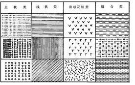
Figure 11-16: Various line styles
Annotation
Notes are complementary to the above two means, notes should be closely combined with the thematic content to enhance the effect of phenomena. For type maps and zoning maps, notes are generally used.
Hard copy devices used in GIS:
Hard Copy Devices (Hard Copy Devices) are used in the output of GIS cartography, the so-called hard copy devices depend on data and cannot be preserved for a long time, while the contents of hard copy output can be preserved for a long time, as opposed to the “soft copy” displayed on the screen.
Raster printers and plotters
The raster output device outputs the map through the image generated by the lattice, according to the difference of output quality and output area size, it can be divided into:
1.1) Dot Matrix Printer
Dot matrix printer is the simplest raster printer, which is suitable for situations where the output quality is not high and the cost is saved.
1.2) Inkjet Printer
Compared with ordinary dot matrix printers, inkjet plotters can print maps with larger format and higher quality, at present, the output accuracy of high-quality inkjet plotters can exceed 1000DPI.
1.3) Electrostatic plotter
It is mainly used to output maps with large area (more than 2m).
1.4) Laser Printer
At present, black-and-white laser printer is mainly used to output text, but also can be used to print gray graphics, color laser printer can be used to print high-quality maps.
1.5) Laser plotter
Laser plotter can achieve very high resolution (2000 DPI) for printing large-scale maps.
1.6 Hot Wax (Heat Transfer) Printer
Hot wax printers can print brighter and more contrast images.
1.7) Thermal sublimation printer
The mechanism of thermal sublimation printer is to sublimate pigments to gaseous state and output them to paper surface, thermal sublimation makes each output slightly blurred, which is suitable for output photos, images, etc., but not for printing text.
Pen plotter with vector mode
Pen plotter works directly in vector mode, it manipulates the drawing pen through a series of commands to draw, which can achieve high output resolution, but it needs to convert all map data into vector format, another disadvantage of pen plotter is that it takes a long time to output complex maps.
Photography
That is, the camera is used to shoot the screen to obtain an image, this method is the simplest and can be used when the accuracy is not high.