2.13.1.
Vue.js
Class 
class
and
style
are attributes of the HTML element, which is used to style the element, and we can use the
v-bind
to set style properties.
v-bind
Dealing with
class
and
style
the expression can be an object or an array in addition to a string.
v-bind:class
can be abbreviated as
:class
.
2.13.2.
class
property binding 
We can do it for In the instance, the general The above examples We can also pass in more properties in the object to dynamically switch between multiple In addition The above examples When the We can also bind an object in the data directly: The rendering of instance 3 is the same as that of instance 2. In addition, we can bind a computational property of the returned object here. This is a common and powerful model:
v-bind:class
set an object to switch dynamically
class
:Example 1 
isActive
set to
true
shows a green one.
div
block, if set to
false
does not display:<div:class="{ 'active': isActive }"></div>
       div
       class
the rendering result is:<div class="active"></div>
class
.
:class
instructions can also be similar to ordinary
class
properties coexist.Example 2 
text-danger
Class background color overrides the
active
class background color:<divclass="static":class="{ 'active' : isActive, 'text-danger' :
hasError }"></div>
       div
       class
the rendering result is:<div class="static text-danger"></div>
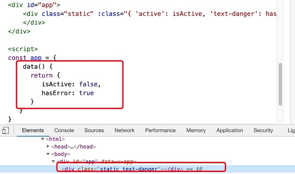
isActive
or
hasError
changes, the
class
attribute value will also be updated accordingly. For example, if the value of
active
is
true
, the
class
list will become “static active text-danger”.Example 3 
text-danger
Class background color overrides the
active
class background color:<divid="app"><divclass="static":class="classObject"></div></div>
Example 4 
data(){return{isActive:true,error:null}},computed:{classObject(){return{active:this.isActive&&
!this.error,'text-danger':this.error&&this.error.type==='fatal'}}}
2.13.3. Array syntax 
We can pass an array to The above examples We can also use ternary expressions to switch between the The above examples
v-bind:class
the example is as follows:Example 5 
<divclass="static":class="[activeClass, errorClass]"></div>
       div
       class
the rendering result is:<div class="static active text-danger"></div>
class
:Example 6 
errorClass
is always there.
isActive
for
true
add when
activeClass
class:<divid="app"><divclass="static":class="[isActive ? activeClass : '',
errorClass]"></div></div>
       div
       class
the rendering result is:<div class="static text-danger"></div>
2.13.4.
Vue.js
style (inline style) 
We can do it in The above examples You can also bind directly to a style object to make the template clearer: Note: When using CSS attributes that require a specific prefix, such as
v-bind:style
set the style directly, which can be abbreviated to
:style
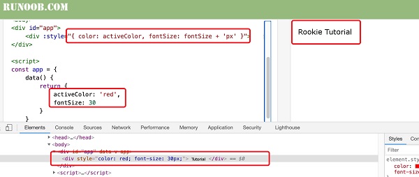
:Example 7 
<divid="app"><div:style="{ color: activeColor, fontSize: fontSize + 'px'
}">Rookie Tutorial</div></div>
       div
       style
the rendering result is:<div style="color: red; font-size: 30px;">Rookie Tutorial</div>
Example 8 
<divid="app"><div:style="styleObject">Rookie Tutorial</div></div>
v-bind:style
can use an array to apply multiple style objects to an element:Example 9 
<divid="app"><div:style="[baseStyles,
overridingStyles]">Rookie Tutorial</div></div>
transform
and
Vue.js
, the
v-bind:style
will automatically detect and add the corresponding prefix.”.
2.13.5. Multiple value 
Can be used for
style
in binding
property
provides an array of multiple values, often used to provide multiple prefixed values, such as:
<div :style="{ display: ['-webkit-box', '-ms-flexbox', 'flex'] }"></div>
Writing in this way only renders the last value in the array supported by the browser. In this example, if the browser supports a
flexbox
then itwill only render
      display:
      flex
.
2.13.6. Used on the component
class
attribute 
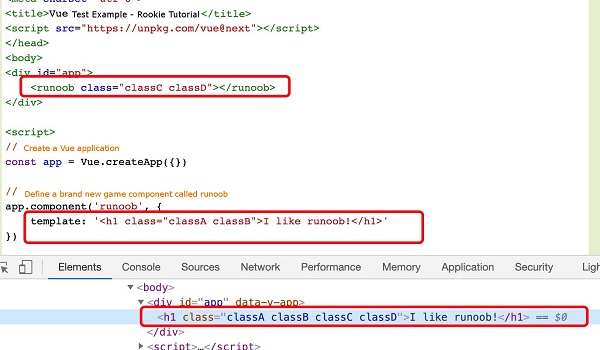
When you use on a custom component with a single root element The above examples For with data binding When If your component has multiple root elements, you need to define which parts will receive this class. Can be used Note: The above examples
class
property, these
class
will be added to the element. Existing on this element
class
will not be overwritten.Example 10 
<divid="app"><runoobclass="classC classD"></runoob></div><script>//
Create a Vue application const app=Vue. createApp ({})//Define a name called
The new global component of runoob app.component('runoob', { template: '<h1class="classA
classB">I like runoob!</h1>' }) app.mount('#app')</script>
       div
       class
the rendering result is:<h1 class="classA classB classC classD">I like runoob!</h1>
class
the same applies:<my-component :class="{ active: isActive }"></my-component>
isActive
for
true
the HTML is rendered as:<p class="active">Hi</p>
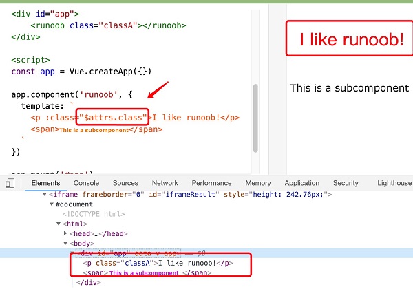
$attrs
the component property does this:Example 11 
<divid="app"><runoobclass="classA"></runoob></div><script>const app =
Vue.createApp({}) app.component('runoob', { template:
\`<p:class="$attrs.class">I like
runoob!</p><span>This is a subcomponent</span>\` }) app.mount('#app')</script>
template
is a backquotation mark, not a single quotation mark.
       div
       class
the rendering result is:<div id="app" data-v-app=""><p class="classA">I like runoob!</p><span>This is a subcomponent</span></div>