Foundation can easily create a reminder box:
提醒框可以使用 The width of the reminder box is 100% of the container. 尝试一下 » To close the reminder box, you can add to the connection or button element & times; (x) is a HTML character entity that represents an icon for a close button, rather than the letter “x”.
.alert-box
类创建, 可以添加可选的类:
.secondary
,
.success
,
.info
,
.warning
或
.alert
: 8.9.1. Example 
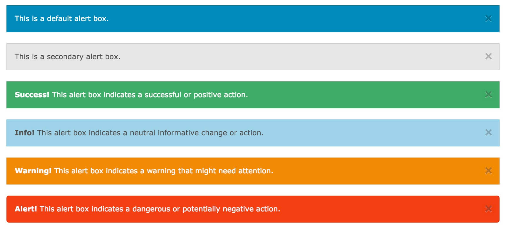
<div data-alert class="alert-box">
  This is a default alert box.
</div>
<div data-alert class="alert-box secondary">
  This is a secondary alert box.
</div>
<div data-alert class="alert-box success">
  <strong>Success!</strong> This alert box indicates a successful or
positive action.
</div>
<div data-alert class="alert-box info">
  <strong>Info!</strong> This alert box indicates a neutral informative
change or action.
</div>
<div data-alert class="alert-box warning">
  <strong>Warning!</strong> This alert box indicates a warning that
might need attention.
</div>
<div data-alert class="alert-box alert">
  <strong>Alert!</strong> This alert box indicates a dangerous or
potentially negative action.
</div>

Fillet reminder box 
.radius
And
.round
Class is used to fillet the reminder box 8.9.2. Example 
<div data-alert class="alert-box success radius">
  <strong>Success!</strong> Alert box with a radius.
</div>
<div data-alert class="alert-box info round">
  <strong>Info!</strong> Alert box that is rounded.
</div>
Close the reminder box 
class="close"
Class and initialize the Foundation JS: 8.9.3. Example 
<div data-alert class="alert-box">
This is a default alert box with closing functionality.
<a href="#" class="close">×</a>
</div>
<script>
// Initialize Foundation JS For Functionality
$(document).ready(function() {
$(document).foundation();
})
</script>