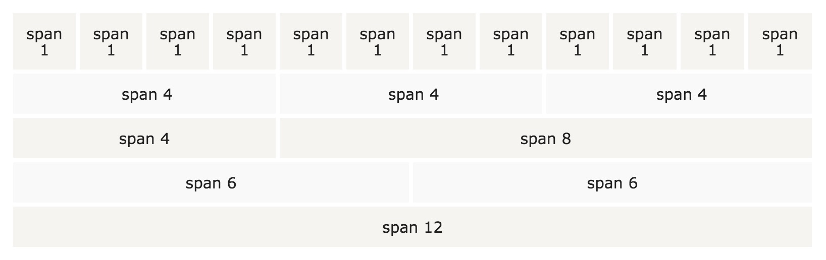
The Foundation grid system has 12 columns.
If you don’t need 12 columns, you can merge some columns to create some columns with larger widths.
Foundation’s grid system is responsive. The column automatically resizes according to the screen size. On a large screen, there may be three columns, and the small screen size may be three single columns, arranged in order.